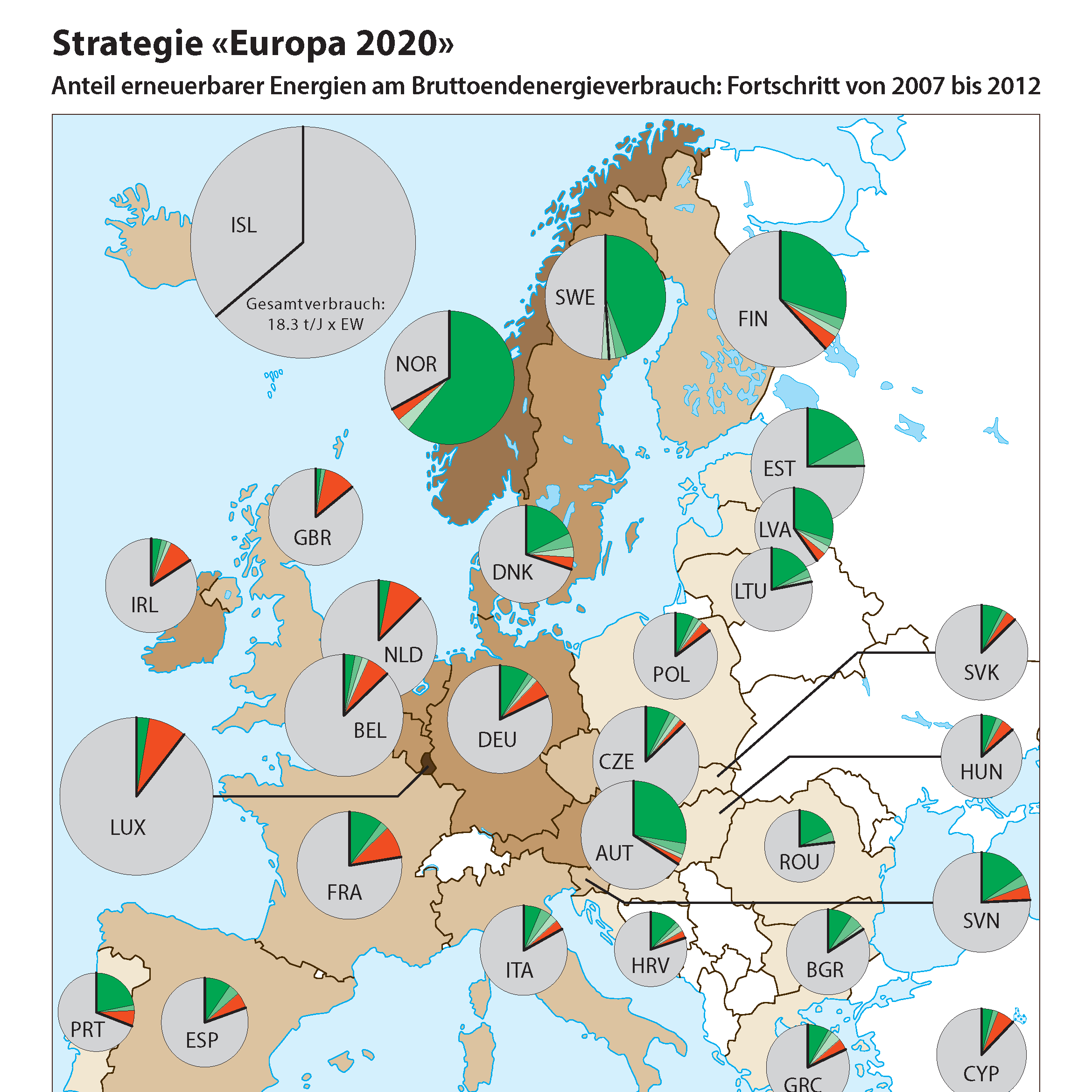
An interactive web map created with the aim to visualise data measured with a senseBox and compare it to public open source data.
Web App Structure
The web app (or webpage) itself is structured hierarchically. First, it is vertically divided into header, section and footer. Header and footer are two bars at the top and bottom respectively, whereas the section part fills all the space in between.
The section is divided again into a imprint, sources, and map part. However, the map part fills the entire section area as the imprint and source are in fact popups that are displayed on top of the map when visible.
The map part is once more divided (now horizontally) into a map navigation area and a map view area. The map navigation area contains a short about text as well as the functionality to toggle the layers displayed in the map (layer selection). The map view area in turn serves as the container for displaying the map. The legend of the map is directly displayed within the layer selection part of the map navigation area.
Additionally, all "title bars" (namely header footer and popup headings) follow the same structure: text to the left and buttons to the right.
In the following, all these elements are listed again in a more graphical way:
- Header (a "title bar")
- Section
- Imprint part
- Panel header (a "title bar")
- Content container
- Sources part
- Panel header (a "title bar")
- Content container
- Map part
- Map navigation area
- About section
- Layer selection section (incl. legends for the respective layers)
- Map view area
- Footer (a "title bar")
General Functionality
The web app was implemented to be responsive, although very rudimentarily so. Implemented responsive features include:
- Scrollbars for overflowing content in vertical direction
- Map re-sizes to available space
- Button text changes to icons when not enough space in horizontal direction
- Scrollbars for overflowing content in vertical direction
- Map re-sizes to available space
- Button text changes to icons when not enough space in horizontal direction
However, the minimum width still is at around 880px which is still way too much for cell phones.
The webpage's popups were designed to appear above the map view area to avoid conflict with the text in the map navigation area. The method to show or hide them was implemented in such away that only one popup is visible at the time.
Map Functionality
The map was implemented using the ArcGIS API for JavaScript (version 4.10) by Esri. By default, the map shows the topographic basemap provided by Esri. It features widgets for toggling the basemap (to labelled satellite imagery), for zooming, and for searching a specific location as well as a scale bar widget. Additionally, the overlayed map layers can be toggled using the list of checkboxes in the map navigation area. Toggling overlayed map layers will automatically hide the corresponding legend.
Layout Design
The layout was designed to be as simple and straight-forward as possible. As the map is the most important part of the web app, it was assigned the most space of the page and is also the element that expands if the window gets bigger.
Colour Concept
In accordance with the theme of the web app - light - the colours were chosen to be dark blue with yellow and white accents. Additionally, a matching red was chosen as a highlight colour as it sticks out on the topographic and the satellite imagery basemap. Gradients between the dark blue and yellow colour were used to gain variations of the primary colours.
The colours of this webpage were chosen with the help of the tools ColorSpace (calculating the gradients) and Coolors (finding a visually pleasing colour palette).
Map Design
The map design was kept as simple as possible in order to put the focus on the visualised data. Thus, the basemap was chosen to be the quite subtle "topo" Esri basemap. It also has the advantage that it shows trees, which might be of interest regarding street lamp lights.
The widgets of the map were arranged in the different corners of the map to avoid cluttering in one corner. The arrangement is similar to the very familiar one of Google Maps, except that the search widget is in the upper right corner as it isn't that important for the purpose of this web app.
Regarding the displayed data, the illumination values (lux) were transformed with (x/100)^3 to emphasise the points with high values. The normailsation (division by 100) was possible because all the initial values were within the range 1-100.
Credits and Acknowledgements
This web map was developed as a student exercise as part of the lecture "GIS III" in 2018 at the Institute of Cartography and Geoinformation, ETH Zurich.
