A 3D interactive web map (link to map) showing how literacy rates in selected African countries developed over the last decade.
About the 3D Web Map
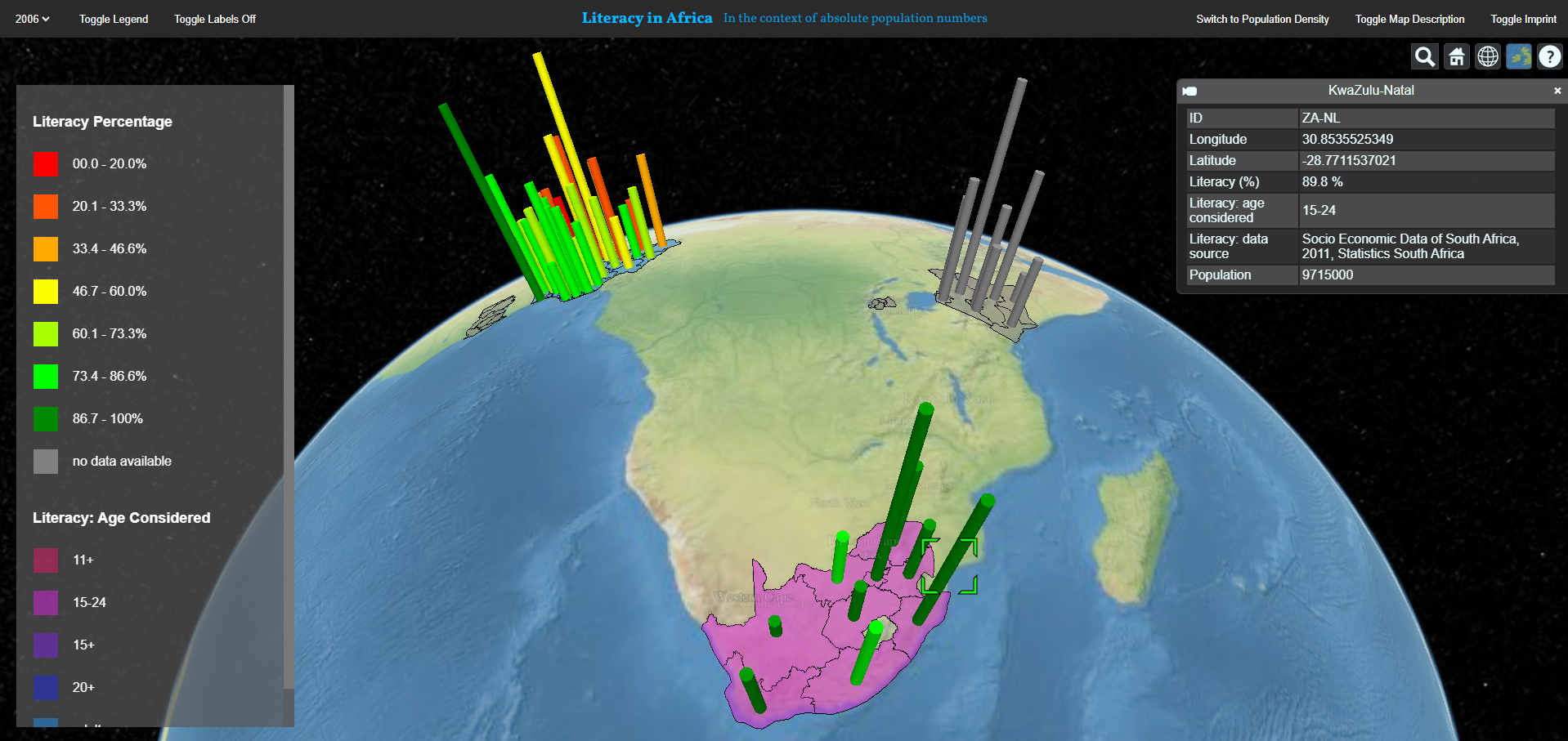
This map shows the literacy rates (color) of five African countries (Ghana, Kenya, Nigeria, Rwanda, South Africa) over time and in the context of either absolute population counts or population density (extrusion height). The aim of this map is to visualise the spatial differences and temporal development of the literacy rates and their possible relation to population numbers. It also illustrates the difference between absolute population counts and population density and how important it is to know which measure one is talking about.
The map has two views:
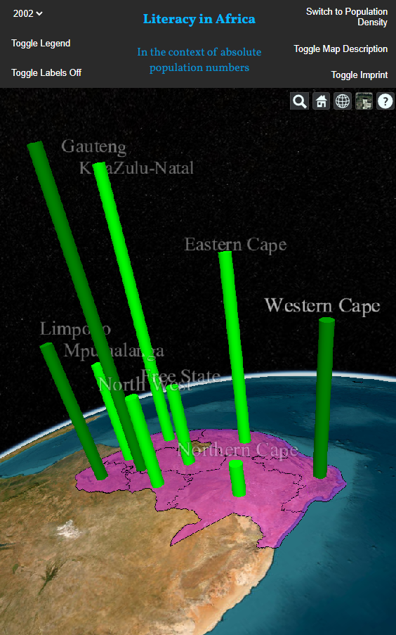
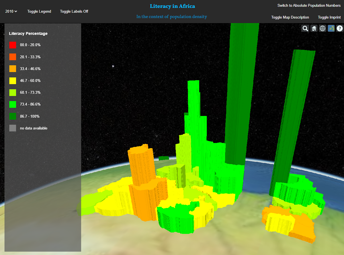
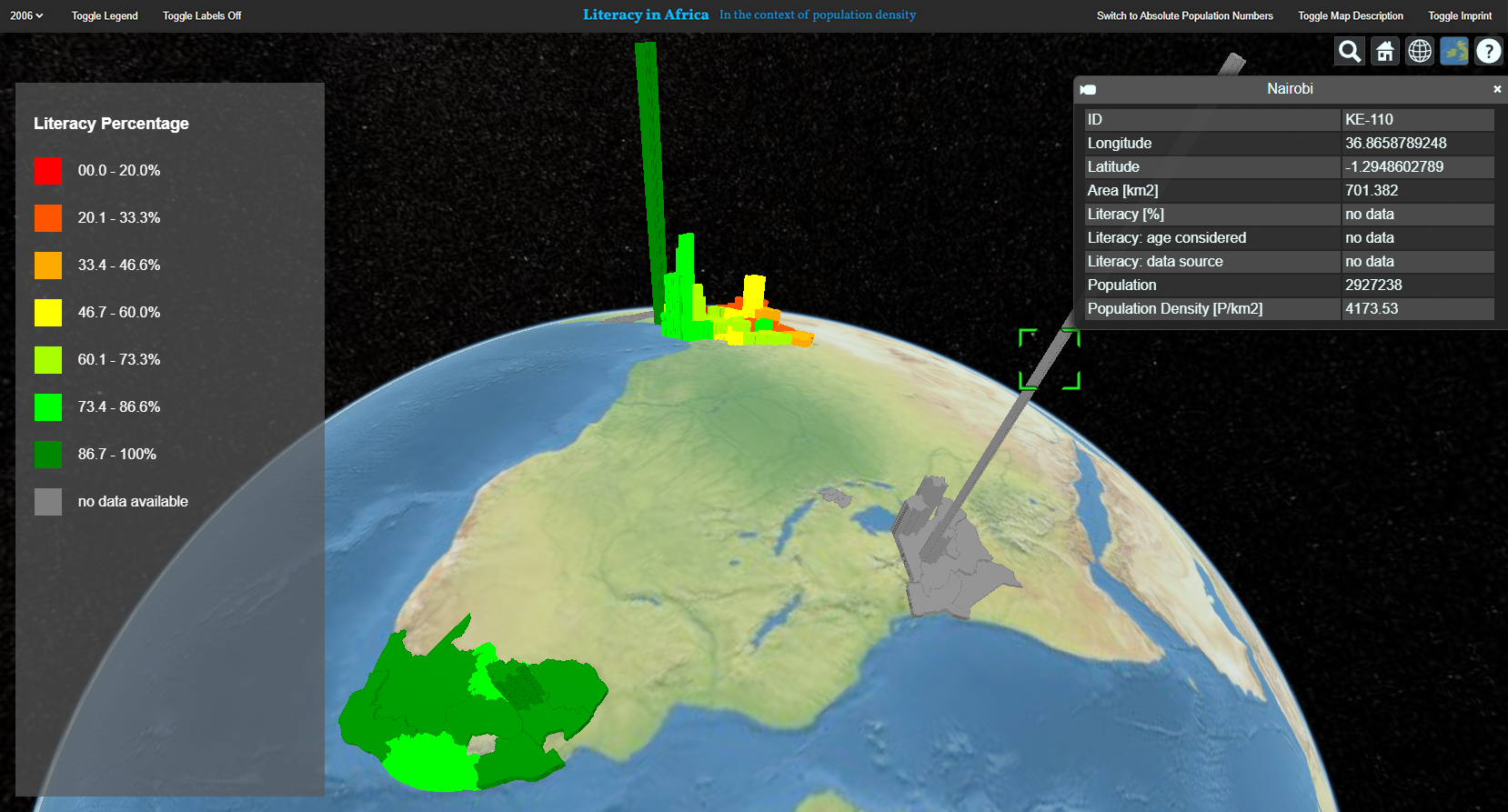
- The first view (images: top, middle left) shows cylinders on coloured ground polygons. The second view shows extruded polygons (images: middle right, bottom).
The first view shows the literacy rate and the the age considered when surveying, as different surveying authorities use different age categories. This view thus visualises the following three variables:
- Cylinder colour: literacy rate
- Cylinder height: absolute population count
- Ground colour: age considered
- Cylinder height: absolute population count
- Ground colour: age considered
The second view does not show the age considered. Instead it adequately shows population count relative to an administrative unit's area, thus visualising population density. For example, a large administrative units with a reasonably high population count will not be shown as a tall cylinder but as a flatter but wide volume. This view thus visualises the following three variables:
- Pillar colour: literacy rate
- Pillar height: population density
- Pillar volume: absolute population count
- Pillar height: population density
- Pillar volume: absolute population count
Data
The web map uses geodata (the 2D geometries of the countries) and statistical data. The geometries were downloaded from Mapzen. The literacy rates were collected from Open Data for Africa, Statistics South Africa, and the Ministry of Education of Rwanda. The exact data source of a specific literacy rate visualised in the map can be viewed in the attribute table (to access it, click on the pillar of interest). The population data was collected from Open Data for Africa, Statistics South Africa, and the National Institute of Statistics of Rwanda respectively.
Source Code
The source code is available on GitHub. The live web map is also hosted using GitHub Pages. However, the data loads quite slowly.
Credits and Acknowledgements
This web map was created as a student exercise during the course "Multimedia Cartography" in spring 2017 at the Institute of Cartography and Geoinformation, ETH Zurich.